Topic: The Power of Color in Character Design
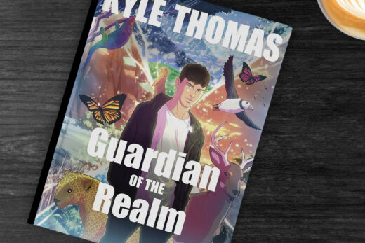
Color is a powerful visual tool that can evoke emotions and tell stories without the use of words. In character design, the use of color can make or break the impact of a character. It can set the tone, convey personality, and create a connection with the audience. As a character designer, understanding the power of color and how to use it effectively is crucial. In this article, we will explore the importance of color in character design and provide tips on how to use it to capture emotions in your designs.
Color Psychology in Character Design
Colors have the ability to trigger different emotions and associations in our minds. This concept, known as color psychology, is often used in marketing and branding to influence consumer behavior. Similarly, in character design, color can be used to evoke specific emotions in the audience. For example, warm colors like red and orange can convey energy, passion, and excitement, while cool colors like blue and green can evoke calmness, trust, and intelligence.
When designing a character, it is important to consider the personality and traits of the character and how color can help convey them. A villain character may be associated with dark and cool colors like black and purple, while a hero character may be associated with bright and warm colors like yellow and red. Using color psychology can add depth and complexity to your character designs, making them more relatable and memorable to the audience.
Creating Contrast and Balance
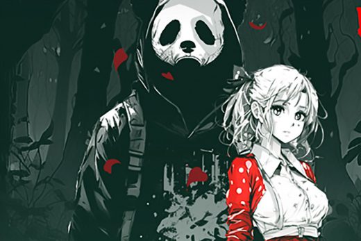
In character design, color can also be used to create contrast and balance. Contrast is the difference between light and dark colors, while balance refers to the distribution of colors in a design. By using contrasting colors, you can draw the viewer’s attention to certain elements of the character, making them stand out. For example, a predominantly dark-colored character can have a splash of bright color in their design, drawing the audience’s attention to that specific area.
On the other hand, balance is important to create a harmonious design. Too much contrast can be overwhelming and chaotic, while too little can be dull and uninteresting. A good balance of colors can create a visually appealing design that is pleasing to the eye. When choosing colors for your character, consider the overall balance and how each color complements or contrasts with each other.
Color in Storytelling
In addition to evoking emotions and creating contrast and balance, color can also be used to tell a story. In character design, color can be used to symbolize a character’s journey or transformation. For example, a character who starts off as timid and fearful may be depicted in dull and muted colors, but as they grow and become more confident, their color palette can transition to brighter and bolder colors.
Furthermore, color can also be used to create a sense of environment and atmosphere in a character’s design. A character living in a lush green forest may have a color palette dominated by shades of green, while a character living in a cold, desolate landscape may have a color palette dominated by shades of blue and gray. Using color to establish a character’s surroundings can add depth to their story and make them feel more grounded in their world.
Final Thoughts
As a character designer, the use of color should not be taken lightly. It is a powerful tool that can enhance your designs and bring your characters to life. By understanding color psychology, creating contrast and balance, and using color to tell a story, you can capture the emotions of your audience and create characters that are truly memorable. So, the next time you are designing a character, remember the power of color and use it to your advantage.


